Tuesday, January 10, 2017

Pre-K / Kindergarten Monsters

I did this lesson with both Pre-K and Kindergarten. They turned out so hilarious and adorable in both cases. We started out by painting the background, where their goal was just to fill up that white space. We talked about fall colors and warm colors. 
Then, we drew the shape of our monsters (which was very open-ended) on cool colored paper. I gave them a lot of ideas for shapes of their monsters, but I didn't want to put too many constraints on it to see what they could come up with (as you can see the results were all VERY different). 
Then, we glued the mouth, teeth, and eyes (pre-cut by me) on. I told them they could have as many or as little eyes and teeth they wanted, but everyone could only have one mouth. We added the center of the eye with a black crayon, then glued in onto their background.
 I kid you not, I laughed to the point of tears the entire time I hung these up. Kids loved it too!

2nd Grade: Aztec Suns


First students learned about the cultural significance of the sun patterns in Aztec (and other central American) cultures. They also learned about radial symmetry. We designed our suns the first day, just using pencil on paper that was the same size as the foil (5''x5''). (My completed example pictured above. 

 On day two we pressed our designs into the foil (I pre-taped their drawing onto the foil), going over it once on paper (using colored pencils so they could see the parts they'd done already) and a second time to deepen the design into the foil. 
 On day three we colored in our suns with sharpie, keeping the idea of radial symmetry and making sure they didn't color over the lines they had pressed out. 
On day four we created a mosaic border with cut paper. I had pre-taped the foil to the black paper (6.5 x 6.5) and cut the 1 inch squares. I told them they should keep their squares in some sort of pattern and that they should lay them out to measure how many they would need first. 
I really liked the way they turned out! 

Wednesday, July 6, 2016

8th Grade: Mixed Media Stratas

This project was a little out there, but I wanted to do mixed media and I wanted to incorporate some poetry, so this is what I came up with. 
All of the students has to write a poem about themselves. Mine had to do with my childhood (using the "I am from..." format. I gave them a lot of examples, some silly, some serious. They wrote their own. If they seemed to be struggling, I gave them a guide/ template to help them write their poems. 
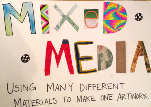
Then, we talked about mixed media, imagery, and collage. We talked about how we could pull out certain images from our poem to create something unique. 
Unfortunately, I don't have many process photos, but I will explain how we made these:
1. Everyone got a canvas board. They could collage and paint on these. I encouraged them to bring in materials from home, but I had some to supplement. 
2. The second layer (which needed to house the third layer) was placed on top of the canvass board using a few layers of cardboard underneath to make it "pop out."
3. The third layer, which was supposed to be one object or image (picture, magazine cutout, or drawing), was placed on top of the second layer in the same manner. 

Here are some of the student examples and their poems:


6th Grade: Chalk Planet Aliens

This was probably my favorite middle school lesson. Basically, I gave each table a different planet. I used the Sun instead of the Earth and no Pluto:( 

Each group researched all about their planet (or Sun) and kept a fact sheet as a group. Then, using chalk pastels, they drew their planet onto a black paper. They were supposed to include surrounding objects, like moons, asteroids, etc. that they learned about during their research. For example, I did four of Jupiter's moons in the background. They added stars afterwards. 

I then had students create an alien that could survive on the planet they were given. For example, mine had tentacles because Jupiter has no solid surface, so my alien could float/ swim around. My alien also had three eyes because Jupiter is farther away from the sun. (Disclaimer: I understand that the alien part of this is NOT scientifically sound, but it was cute)!

Students also had to add one personal object to their alien, hence my alien's guitar. 
Here is one student's example and her explanation:

Last, they cut out their aliens, glued a few pieces of cardboard to the back (to make it stick out), and glued it to their planet background. Here are some of the results:
^Personal favorite (alien on the Sun)
"He's supposed to be sideways because he has gravity shoes"


7th grade: Monochromatic Portraits


Wanted to find a new and interesting way to do portraits because I think portraits are boring. This was my response. I ended up adding another fun personalization for the students at the end of the unit. Stay tuned! My example is pictured above. 

I started this lesson by showing them a power point of a lot of cool portraits and artists (lots of fun facts and discussions through out to keep them interested). Then, I had them do pre-instructional portraits in their journals (duh)! Some of my favorites are pictured below. 

After this, I did a lesson on facial proportions where I did a guided drawing with them to learn the ratios and spacial relations of facial features. They all had a step-by-step instruction packet as well to follow along with. Lots of "ah-ha!" moments.
^ The guided drawing
^ Non- example

I took a photograph of each student and printed one out for each of them. Then, we started to make our grids. This was hard for some students and took a while. (My examples below)

Once they had their grid correct, they went box by box to create a contour outline of their face in pencil, then outlined it in Sharpie. 

Then, I talked about finding different highlights and shadows on your face and assigning them numerical values. 10 as the lightest and 1 as the darkest. This part was also tricky for some students. 
Then, starting with their chosen base color (mine was blue) they painted the darkest values with no white mixed in. As they continued to add white to their paint, they worked from 1 to 10. Some of them used pure white as their 10. 
Last, I had them paint the complimentary color of their portrait in the background with water color. As an afterthought, I decided to have them write their hopes for the future in Sharpie on top of their background to add a personal touch. Below are some student examples. I think they did great!
 Loved the composition on this one^

For my two students with special needs, I modified this by having them choose their color and make an "abstract" painting. Then, we put a piece of transparent paper over a mirror for them to trace their face. I overlaid this with their painting and the results (below) were cute!

All in all, I think this unit was pretty long and complicated for my 7th graders. In the future I would simplify it, or do it with 8th or 9th graders. I might have used colored pencils instead of paint. The mixing was difficult for them. I think the kids were pretty proud of their final products though. 


6th Grade: Cubist Still Life; Mixed Media

In retrospect, I would definitely simplify this lesson for 6th and 7th graders or make it into an 8th/ 9th grade project. However, I was very proud of what my students came up with. 

For this lesson, we began by talking about how objects can hold meaning and even a narrative. I had students work in group to create their "still life narrative." They sketched their creation in their journals and filled out a worksheet explaining their narrative. 
They traced their given objects onto the base paper I gave them so that we could use it every class. 

For homework, students had to bring in an object that held personal meaning to them to add to their own drawing.
Then we started to sketch our compositions. I emphasized how to create an interesting composition before we started.
^(Good composition example)
^(bad composition example)

Student works in progress below (contour lines only, no shading)
Then, we worked on finding highlights and shadows in the drawing and making them into shapes. This didn't go well for my 6th graders. Many were confused, so I let this go. 
After this, I had the students create four triangular sections of their artwork, then had them cut them out. (In retrospect, I WOULD NOT cut them out first. It was hard for some of my students to understand each piece would have a different media on it; I would have them cut the pieces out at the very end of the project).


The first wedge was shaded in pencil only. My example is below.
For each new media, I taught them a few simple techniques to use. Here are some examples for the oil pastel section:
My example for the pastel wedge:
My example for the water color wedge:
My example for the collage wedge:
(This was everyone's favorite part)

After we completed all of our wedges, I had the students glue their wedges back together on a piece of black card stock, leaving gaps in between each wedge. I also allowed them to cut out extra white space if they wanted to. 

Pictured below is some of the amazing work they did: